#329 More on Twitter Bootstrap pro
- Download:
- source codeProject Files in Zip (167 KB)
- mp4Full Size H.264 Video (35.7 MB)
- m4vSmaller H.264 Video (17.3 MB)
- webmFull Size VP8 Video (16.9 MB)
- ogvFull Size Theora Video (44.3 MB)
In the previous episode we showed you how to use Twitter Bootstrap with Rails. This time we’ll be adding on to the project we started last time. We’ll show you how to improve forms with Simple Form and how to customize Twitter Bootstrap with LESS and how to switch over to SASS if you prefer to use that.
Improving The User Experience
Here’s where we ended up last time. We’ll start by focusing on some of the user experience issues that this app has.
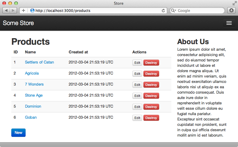
One of these issues is that flash messages aren’t being shown. It we update a product through the edit form there’s no flash message saying that the product was updated. If we take a look at the components section of the documentation we’ll see that there’s a section on alerts and these work perfectly for displaying flash messages to the user. The default options to let us display three types of alert: success, information and warning. To display the update message we simply need to wrap the flash message in a div with a CSS class of alert-success.
We’ll add the flash messages to the application’s layout file, inside the container but above the content.
<div class="container">
  <% flash.each do |name, msg| %>
    <div class="alert alert-<%= name == :notice ? "success" : "error" %>">
      <%= msg  %>
    </div>
  <% end %>
  <!-- Rest of content -->
</div>
Here we loop through the messages and display each one. We wrap each message in a div and use the name of the flash message to determine whether it should be displayed as a success alert or an error alert. When we update a product now we’ll see the flash message.

Twitter Bootstrap makes it easy to add a close button to an alert, all we need to do is add another line of code.
<div class="container">
  <% flash.each do |name, msg| %>
    <div class="alert alert-<%= name == :notice ? "success" : "error" %>">
      <a class="close" data-dismiss="alert">x</a>
      <%= msg  %>
    </div>
  <% end %>
  <!-- Rest of content -->
</div>
If we update a product now we’ll see an ‘x’ button that will close the alert when clicked.
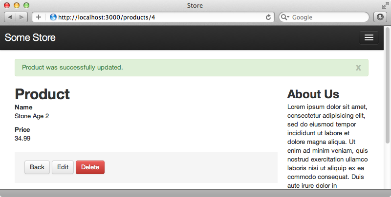
This functionality is handled via JavaScript. We haven’t talked much about the JavaScript that Bootstrap provides yet but it includes many useful jQuery plugins. We can use these to create modal dialogs, dropdowns, tabs, tooltips, popovers that display information when a user hovers over an element, and a whole lot more. All of these plugins are already included in our Rails application. If we look in the application.js file we’ll see that a twitter/bootstrap file is included and this loads all the plugins. There’s also a bootstrap.js file which enables some of the plugin functionality.
jQuery ->
  $("a[rel=popover]").popover()
  $(".tooltip").tooltip()
  $("a[rel=tooltip]").tooltip()
Validations
Another place where we can improve the user experience in our Rails application is in the forms, specifically regarding validations. We don’t have any validations on the Product model yet so we’ll start by adding some.
class Product < ActiveRecord::Base
  validates_presence_of :name, :price
end
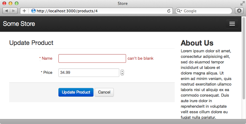
If we try editing a product now and leave one of the fields blank we’ll be taken back to the form but no error messages is shown to tell us what we’ve got wrong. Twitter Bootstrap includes a nice way to display error messages in a form and it will colour the form field for invalid fields so we’ll use this on our Product form. The problem with doing this is that the markup for our form is fairly complex as it is. If we were to try to embed the logic in there for the validations the page would get messy very quickly.
<%= form_for @product, :html => { :class => 'form-horizontal' } do |f| %>
  <fieldset>
    <legend><%= controller.action_name.capitalize %> Product</legend>

    <div class="control-group">
      <%= f.label :name, :class => 'control-label' %>
      <div class="controls">
        <%= f.text_field :name, :class => 'text_field' %>
      </div>
    </div>

    <div class="control-group">
      <%= f.label :price, :class => 'control-label' %>
      <div class="controls">
        <%= f.text_field :price, :class => 'text_field' %>
      </div>
    </div>

    <div class="form-actions">
      <%= f.submit nil, :class => 'btn btn-primary' %>
      <%= link_to 'Cancel', products_path, :class => 'btn' %>
    </div>
  </fieldset>
<% end %>
To help us here we’ll use a gem to render out the form. SimpleForm recently added Bootstrap support and while we could use Formtastic with the Formtastic Bootstrap gem we’re going to use SimpleForm here. To use it we’ll need to add its gem to the gemfile and then run bundle.
gem 'simple_form'Next we’ll need to run SimpleForm’s installation generator. Note that we pass the --bootstrap option so that the Twitter Bootstrap variation is used.
$ rails g simple_form:install --bootstrap
Now we can switch our form over so that it uses SimpleForm. We’ll need to replace form_for with simple_form_for at the top of the form and then we can use SimpleForm’s input method to define the name and price fields.
<%= simple_form_for @product, :html => { :class => 'form-horizontal' } do |f| %>
  <fieldset>
    <legend><%= controller.action_name.capitalize %> Product</legend>

    <%= f.input :name %>
        <%= f.input :price %>

    <div class="form-actions">
      <%= f.submit nil, :class => 'btn btn-primary' %>
      <%= link_to 'Cancel', products_path, :class => 'btn' %>
    </div>
  </fieldset>
<% end %>
If you’re not familiar with how SimpleForm works take a look at episode 234 which covers it in detail. We can try our product form out now. If we reload it then try to update a product without a name we’ll see an error message displayed by the name field.
Customizing The Styling
Our application now looks a lot better than it did before but what if we want to customize it further and make it feel uniquely our own? For example how do we change the colour of the links and buttons or change the way the header looks? If you take a look at the Using LESS section of the documentation you find a list of variables which can be set to customize the look of our site. We can change the colours, the sizing and so on. Even this page doesn’t list all the variables available; to see these we’ll have to look at the source code.
These variables are defined in a variables.less file and some of the ones listed here aren’t mentioned in the documentation. We can set these variables inside the bootstrap_and_overrides.css.less file. The only thing we need to take care about here is that we set them after the line at the top that imports the bootstrap file. Two variables, iconSpritePath and iconWhiteSpritePath are already set in this file and there’s some documentation in the file for setting some of the other variables.
@import "twitter/bootstrap/bootstrap";

body { padding-top: 60px; }

@import "twitter/bootstrap/responsive";

// Set the correct sprite paths
@iconSpritePath: asset-path('twitter/bootstrap/glyphicons-halflings.png');
@iconWhiteSpritePath: asset-path('twitter/bootstrap/glyphicons-halflings-white.png');

// Your custom LESS stylesheets goes here
//
// Since bootstrap was imported above you have access to its mixins which
// you may use and inherit here
//
// If you'd like to override bootstrap's own variables, you can do so here as well
// See http://twitter.github.com/bootstrap/less.html for their names and documentation
//
// Example:
// @linkColor: #ff0000;
As an example let’s say that we want to lighten up the header. We can do so by setting these variables.
@navbarBackground: #555;
@navbarBackgroundHighlight: #888;
@navbarText: #eee;
@navbarLinkColor: #eee;
When we reload a page on the site now the header is a lighter grey.
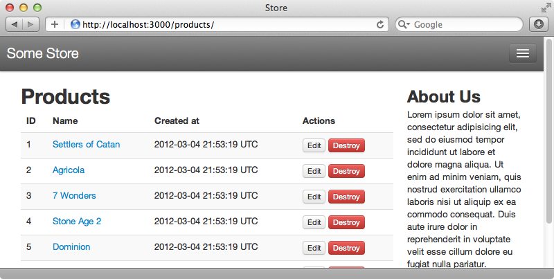
Some things, however, can’t be easily changed by setting variables. Let’s say that we want to set the brand text in the header. The CSS that defines this colour is in the navbar.less file and if we look at the brand class which defines this header we’ll see that it’s set to have a colour based on the value in the @white variable. While we could change the value of this variable, doing so will have side effects that we don’t want. We only want to change this colour in one place and the variables are a little too limiting here. This isn’t too much of an issue, though. As we’re working with CSS we can override any of the default styling in bootstrap_and_overrides.
.navbar .brand {
  color: #FAFFB8;
}
We now have pale yellow brand text and while this isn’t the prettiest design you should now have an idea as to how we can override any style we want.
Customizing What’s Included
As our application develops we may find that there are parts of Twitter Bootstrap that we don’t use. It would be good to remove these to reduce the amount of code that is sent to the client. There’s a useful page on the Twitter Bootstrap website which will let us choose exactly which parts we want to include and then download a customized version. This will download the static files, however, which as we’re using LESS isn’t what we want. Instead we should customize the files that are imported in our Rails application. The bootstrap_and_overrides file imports twitter/bootstrap/bootstrap and if we look at the source code for that imported file we’ll see that it imports many other files and we can use this to determine exactly which files are imported.
To do so we need to replace the line @import "twitter/bootstrap/bootstrap"; at the top of bootstrap_and_overrides with the contents of this bootstrap.less file. This will do the same thing by default but now we can choose exactly which parts of Bootstrap are included. We can do something similar for the JavaScript. The bootstrap.js file requires all the jQuery plugins that Bootstrap provides and so in our application.js file we can replace the //=require twitter/bootstrap line with the contents of that file and then pick and choose exactly what we want to include.
Using SASS instead of LESS
We’ll finish this episode by showing how you can use SASS instead of LESS if you want to. Why might you consider choosing SASS over LESS? If you’re planning on extensively modifying Twitter Bootstrap’s styling you should consider SASS for the reasons given in a recent blog post by Ken Collins, the author of the less-rails and less-rails-bootstrap gems.
With the asset pipeline it’s possible to use both SASS and LESS in the same application. For example If we override something in the CSS, such as the navbar’s brand that we modified earlier, we can move this into a .css.scss file but we need to be sure that the bootstrap_and_overrides is loaded first. The limitations of this technique are that we aren’t able to interact with the variables and mix-ins that Twitter Bootstrap uses as these are defined in LESS code.
If you do want to use SASS to interact with the variables and mix-ins you should consider using the bootstrap-sass gem. This includes a translation of Twitter Bootstrap into SASS so that you’re able to interact the variables and override them. We’ll show you now how to switch an application over from the twitter-bootstrap-rails gem, which uses LESS, to bootstrap-sass. First we’ll need to replace the old gem in the gemfile then run bundle again.
gem 'bootstrap-sass'Next we’ll rename bootstrap_and_overrides.css.less file to end in .scss instead. We then need to replace the contents of the file with the equivalent SASS code.
// Set the correct sprite paths
$iconSpritePath: image-path('glyphicons-halflings.png');
$iconWhiteSpritePath: image-path('glyphicons-halflings-white.png');

$navbarBackground: #555;
$navbarBackgroundHighlight: #888;
$navbarText: #eee;
$navbarLinkColor: #eee;

@import "bootstrap";

body { padding-top: 60px; }

@import "bootstrap-responsive";

.navbar .brand {
  color: #FAFFB8;
}
One important distinction here is that we’re setting the variables before loading bootstrap due to differences between the way SASS and LESS work. After it has loaded we can override any CSS that we want to change.
In the application.js file we need to require bootstrap instead of twitter/bootstrap. As before we can load each individual file separately if we want to select specific plugins to load. The bootstrap-sass README has an example of how to this. If we reload our application now it looks exactly like it did before but we’re now using SASS instead of LESS.


