#234 SimpleForm (revised)
- Download:
- source codeProject Files in Zip (101 KB)
- mp4Full Size H.264 Video (30.9 MB)
- m4vSmaller H.264 Video (13.7 MB)
- webmFull Size VP8 Video (14 MB)
- ogvFull Size Theora Video (32.3 MB)
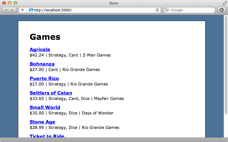
Below is a page from an application that handles selling board games.
The form for creating or updating a game is quite complex. It has several different types of input fields: text boxes, select lists, checkboxes and radio buttons.
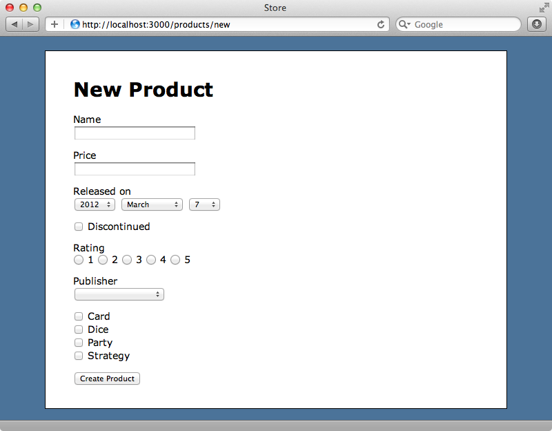
Some of these fields are for associated models. A Product belongs to a Publisher and there’s a select menu for this. It also has a many-to-many relationship with Category which is represented by a series of checkboxes. As you might expect the view template for this form contains a lot of code.
<%= form_for(@product) do |f| %>
  <% if @product.errors.any? %>
    <div class="error_messages">
      <h2><%= pluralize(@product.errors.count, "error") %> prohibited this product from being saved:</h2>

      <ul>
      <% @product.errors.full_messages.each do |msg| %>
        <li><%= msg %></li>
      <% end %>
      </ul>
    </div>
  <% end %>
 <div class="field">
    <%= f.label :name %><br />
    <%= f.text_field :name %>
  </div>
  <div class="field">
    <%= f.label :price %><br />
    <%= f.text_field :price %>
  </div>
  <div class="field">
    <%= f.label :released_on %><br />
    <%= f.date_select :released_on %>
  </div>
  <div class="field">
    <%= f.check_box :discontinued %>
    <%= f.label :discontinued %>
  </div>
  <div class="field">
    <%= f.label :rating %><br />
    <%= f.radio_button :rating, 1 %> 1
    <%= f.radio_button :rating, 2 %> 2
    <%= f.radio_button :rating, 3 %> 3
    <%= f.radio_button :rating, 4 %> 4
    <%= f.radio_button :rating, 5 %> 5
  </div>
  <div class="field">
    <%= f.label :publisher_id %><br />
    <%= f.collection_select :publisher_id, Publisher.all, :id, :name, include_blank: true %>
  </div>
  <div class="field">
    <%= hidden_field_tag "product[category_ids][]", nil %>
    <% Category.all.each do |category| %>
      <%= check_box_tag "product[category_ids][]", category.id, @product.category_ids.include?(category.id), id: dom_id(category) %>
      <%= label_tag dom_id(category), category.name %><br />
    <% end %>
  </div>
  <div class="actions">
    <%= f.submit %>
  </div>
<% end %>
There’s a lot of markup here to generate the form but in this episode we’ll show you how you can significantly clean up form view templates using a gem called SimpleForm. SimpleForm provides a form builder which makes it easy to create complex forms. All we have to do is change form_for to simple_form_for and then use an input method which will generate the appropriate form for the type of attribute that’s passed to it. In this episode we’ll use it to reduce the amount of code in our template.
Adding SimpleForm To Our Application
To install SimpleForm we just need to add it to our gemfile and then run bundle.
source 'https://rubygems.org'

gem 'rails', '3.2.2'

# Bundle edge Rails instead:
# gem 'rails', :git => 'git://github.com/rails/rails.git'

gem 'sqlite3'


# Gems used only for assets and not required
# in production environments by default.
group :assets do
  gem 'sass-rails',   '~> 3.2.3'
  gem 'coffee-rails', '~> 3.2.1'

  # See https://github.com/sstephenson/execjs#readme for more supported runtimes
  # gem 'therubyracer'

  gem 'uglifier', '>= 1.0.3'
end

gem 'jquery-rails'
gem 'simple_form'
Once the gem has installed we’ll need to run SimpleForm’s install generator.
$ rails g simple_form:install
If we were using Twitter Bootstrap in this application, like we did in episode 329, we could pass in a --bootstrap option here. This generator creates a couple of configuration files, which we’ll take a closer look at later on in this episode, and a form template override for the scaffold generator. We can now start cleaning up our template by switching it over to SimpleForm. Here’s what it looks like after we’ve changed it over.
<%= simple_form_for(@product) do |f| %>
  <%= f.input :name %>
  <%= f.input :price %>
  <%= f.input :released_on %>
  <%= f.input :discontinued %>
  <%= f.input :rating %>
  <%= f.association :publisher %>
  <%= f.association :categories %>
  <%= f.button :submit %>
<% end %>
At the top of the form we’ve replaced form_for with simple_form_for. We’ve also removed the code that displays the error messages as SimpleForm has a different way of displaying them. Each field in the form has been replaced with a call to f.input, except for the associations which need to be treaded differently. We’ve used f.association for these. Finally, for the submit button, we’ve used f.button. Our template is now quite a lot smaller.
We’ll need to restart the server for the new gem to be picked up. Once we’ve done so we can reload the new product page to see what our form now looks like.
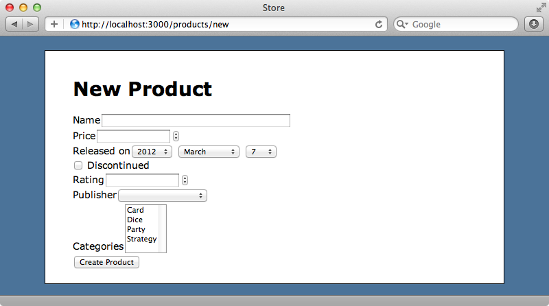
Adding Styling
The form isn’t nearly as pretty now but it can be improved greatly with some styling. We’ll create a new forms.css.scss file and add some CSS there.
.simple_form {
  $indent: 120px;
  label {
    float: left;
    width: $indent - 20px;
    text-align: right;
    margin: 2px 10px;
    &.radio, &.checkbox {
      float: none;
      margin: 0;
      width: auto;
      text-align: left;
    }
    &.checkbox {
      display: block;
      margin-left: $indent;
    }
    &.radio { margin-right: 10px; }
  }
  div.input { margin-bottom: 10px;}
  input.radio_buttons, input.check_boxes {
    margin-right: 5px;
  }
  .btn { margin-left: $indent; }
  .alert-error {
    color: #D00;
    margin-bottom: 10px;
    font-weight: bold;
  }
  .hint, .error {
    clear: left;
    margin-left: $indent;
    font-size: 12px;
    color: #D00;
    display: block;
  }
  .hint {
    color: #555;
    font-style: italic;
  }
}
You can, of course, change this CSS to suit the way you want your forms to look. When we reload our form now it looks much better.
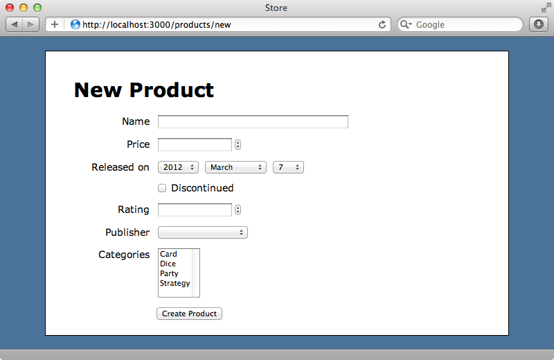
We can see that SimpleForm uses different form fields depending on the type of attribute. We have text fields for string values, numeric fields for number values, select lists for dates, checkboxes for boolean fields and so on. It even handles associations correctly, showing a select list for the belongs_to association with Publisher and a multiple-select for the many-to-many relationship with Category.
Customizing The Fields
If we look at the documentation we can see how different data types are mapped to different types of form field. We might not always want the default form field for a given type, however, so how do we change this? For example we want to use checkboxes for the categories instead of a multiple-select field. We can do this by using the as option.
<%= f.association :categories, as: :check_boxes %>There are many different options that we can use with input and association. For example let’s say that we want to change the label that’s shown next to the released_on field. We can do that by using the label option.
<%= f.input :released_on, label: "Release Date" %>Another handy option we can pass in is called hint. For example we can add a hint to the price field to tell the user which currency the field expects.
<%= f.input :price, hint: "price should be in USD" %>When we reload the page now we’ll see those changes.

Next we’ll try something a little more advanced. The rating field is currently rendered as a numeric field but we want to show five radio buttons instead so that the product can be rated from 1 to 5. This is easy to do. We can pass in a collection option and pass either an array or a range to it.
<%= f.input :rating, collection: 1..5 %>The rating field will now display as a select list with options from 1 - 5. We want radio buttons instead and you can probably guess how we do that.
<%= f.input :rating, collection: 1..5, as: :radio_buttons %>This will now display the rating as five radio buttons.
Validations
What about validation errors? We don’t currently have any validation on the Product model so let’s start by adding one so that the name field is required.
class Product < ActiveRecord::Base
  belongs_to :publisher
  has_many :categorizations
  has_many :categories, through: :categorizations
  validates_presence_of :name
end
When we try submitting the form now without filling in any of the fields we’ll see an error message next to the name field. Notice that SimpleForm has also put an asterisk next to the field’s label to indicate that it’s required.
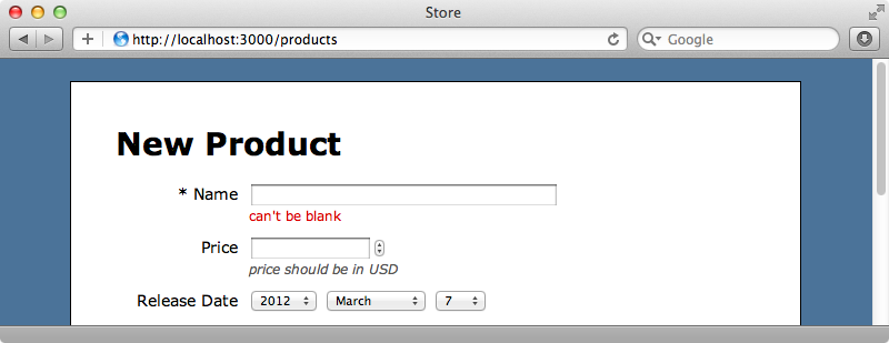
Now that we have validations we’ll add a call to error_notification near the top. This will display some text in red at the top of the form telling the user. Obviously this can be customized and we can change the text and styling to suit our application.
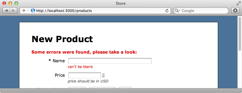
One more thing we can add to our template is a call to f.error :base.
<%= simple_form_for(@product) do |f| %>
  <%= f.error_notification %>
  <%= f.input :name %>
  <%= f.input :price, hint: "price should be in USD" %>
  <%= f.input :released_on, label: "Release Date" %>
  <%= f.input :discontinued %>
  <%= f.input :rating, collection: 1..5, as: :radio_buttons %>
  <%= f.association :publisher %>
  <%= f.association :categories, as: :check_boxes %>
  <%= f.error :base %>
  <%= f.button :submit %>
<% end %>
If there’s an error message on the base attribute, which is used when an error doesn’t apply to any of the other attributes, it will now be shown above the button. This is the last thing we need to add to get the form looking the way we want. We’ve reduced the template from over fifty lines of fairly complex view code down to twelve lines of much cleaner code.
SimpleForm’s Configuration Files
There’s a lot we can configure with SimpleForm if we want to change its default behaviour. We’ll start by looking at the simple_form initializer file that was created by the simple_form:install generator. This file is too long to show here as it includes a lot of documentation in comments but you can see it on SimpleForm’s Github pages.
The first configuration option in this file defines the default wrapper. Wrappers are a new feature in SimpleForm 2 and they specify how given fields should be generated. We can create as many wrappers as we want to handle different scenarios and its worth reading through this file to see what each of the options in this configuration file does. As an example we’ll set the default_input_size option as the default text box length it a little wide for our form.
# Default size for text inputs.
config.default_input_size = 30
Another file that the generator created for us can be found in the locales directory.
en:
  simple_form:
    "yes": 'Yes'
    "no": 'No'
    required:
      text: 'required'
      mark: '*'
      # You can uncomment the line below if you need to overwrite the whole required html.
      # When using html, text and mark won't be used.
      # html: '<abbr title="required">*</abbr>'
    error_notification:
      default_message: "Some errors were found, please take a look:"
    # Labels and hints examples
    # labels:
    #   password: 'Password'
    #   user:
    #     new:
    #       email: 'E-mail para efetuar o sign in.'
    #     edit:
    #       email: 'E-mail.'
    # hints:
    #   username: 'User name to sign in.'
    #   password: 'No special characters, please.'
This file can be used for internationalization and we can create different versions of this file if we want to make our application’s forms multilingual. It can also be used to change some of the configuration such as the way that required fields are marked. We could change the mark key’s value so that two asterisks are shown instead of one, for example.
We’ll need to restart our app for any changes to be picked up but one we do we can reload our page and see the changes we’ve made.
An Alternative Gem
One alternative to SimpleForm is Formtastic. This works in a similar way, especially in regards to the way the forms are generated so it’s fairly easy to switch between these two gems if you need to. One significant difference is that Formtastic includes a stylesheet that we can include to style our forms.


