#223 Charts & Graphs (revised)
- Download:
- source codeProject Files in Zip (108 KB)
- mp4Full Size H.264 Video (33.6 MB)
- m4vSmaller H.264 Video (14.9 MB)
- webmFull Size VP8 Video (17.6 MB)
- ogvFull Size Theora Video (36 MB)
Let’s say that we have an e-commerce style application with an administration page that lists the orders that customers have made, including the order number, the time of purchase, whether of not the item is for shipping and the total price.
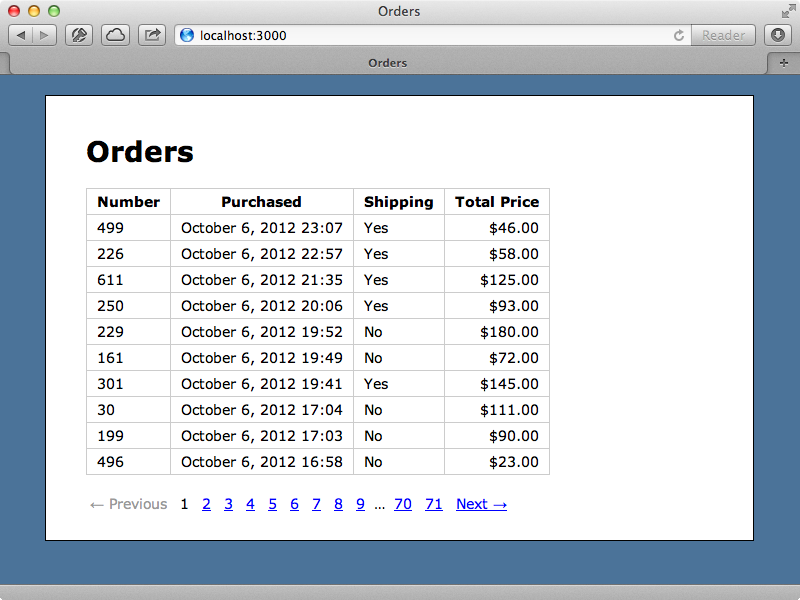
It’s difficult to get an overview of this data. We have a large number of pages of orders and it would be better if we had a line graph showing how much is coming in each day. The best way to make a graph from some data is to use JavaScript. This way we don’t have to worry about dependencies such a Flash on the client or ImageMagick on the server. We’ll use the Morris.js library in this episode as it best fits oar example application but there are a large number of other graphing libraries we could use and we’ll mention some of them at the end of this episode. Morris.js is lightweight and is a great option if we just need a simple line graph that charts something over time such as our order data.
To use Morris.js in a Rails application we can download the compressed version of the library or grab the uncompressed version from the project’s Github pages. We’ll use the uncompressed version as it’s easier to debug and the asset pipeline will compress it for us. Morris depends on the Raphaël JavaScript library so we’ll need to download this as well and again we’ll download the uncompressed version. Once we’ve downloaded these files we can add them to the /vendor/assets/javascripts directory and include them in our app’s JavaScript manifest file.
//= require jquery
//= require jquery_ujs
//= require raphael
//= require morris
//= require_tree .
Adding A Graph
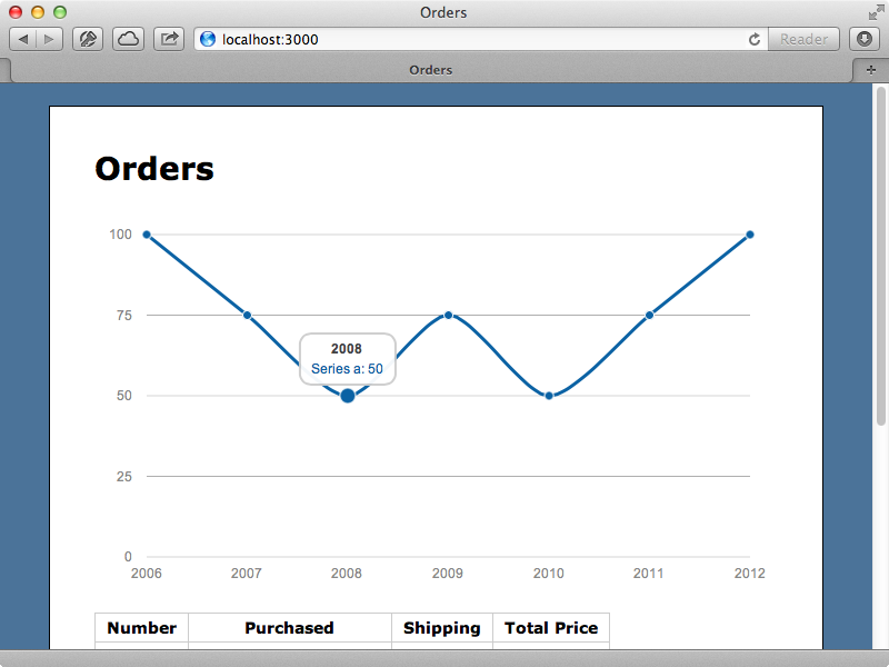
Now that we have Morris set up we’ll add a line graph above the table of orders. There are several examples provided on the Morris site and we’ll use one of them to create a simple line graph. We’ll add the code to the orders CoffeeScript file.
jQuery ->
  Morris.Line
    element: 'annual'
    data: [
      {y: '2012', a: 100}
      {y: '2011', a: 75}
      {y: '2010', a: 50}
      {y: '2009', a: 75}
      {y: '2008', a: 50}
      {y: '2007', a: 75}
      {y: '2006', a: 100}
    ]
    xkey: 'y'
    ykeys: ['a']
    labels: ['Series a']
This will look for an HTML element with an id of annual and generate the graph inside it. We’ll add one to the index template above the table.
<div id="annual"></div>
When we reload the page now we’ll see the graph.
Now that we have our graph we need to add data to it based on the orders in the database. We’ll change the element that the graph will be displayed in to orders_chart and have Morris look for the data for the graph in a data-orders attribute that we’ll add to the orders_chart element.
jQuery ->
  Morris.Line
    element: 'orders_chart'
    data: $('#orders_chart').data('orders')
    xkey: 'y'
    ykeys: ['a']
    labels: ['Series a']
We’ll use content_tag to create the div now as that will make it easier to convert the JSON data. Note that we pass the orders straight in to the data attribute.
<%= content_tag :div, "", id: "orders_chart", data: {orders: @orders} %>When we reload the page now we see a blank chart rather than the data we were expecting. If we look at the source for the page we’ll see the div that we generated along with its data-orders attribute which contains the orders converted to JSON. The graph doesn’t display as we need to tell Morris which attributes to use to create it. We want to use purchased_at for the x-axis and price for the y-axis so we’ll set the xkey and ykeys attributes of our Morris.Line to reflect this.
jQuery ->
  Morris.Line
    element: 'orders_chart'
    data: $('#orders_chart').data('orders')
    xkey: 'purchased_at'
    ykeys: ['price']
    labels: ['Price']
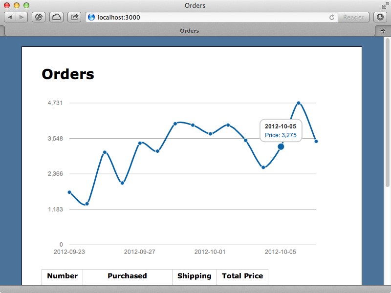
When we reload the page now well see a graph showing the same orders that are on the current page. Each node represents an order and we can see the time that it was made at and its price.
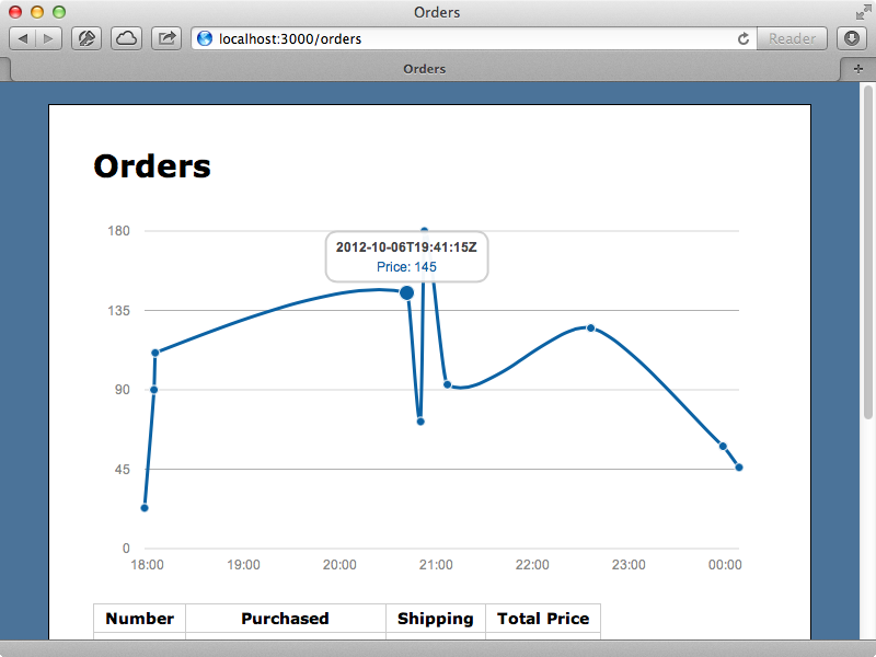
Instead of just displaying a graph for the last ten orders we want to show a bigger overview where each node is a day and the price is the total price for the orders made on that day. To do this we need to change that data that is passed to Morris and, as the logic to do this is fairly complex we’ll move it off into a helper method that we’ll call orders_chart_data.
<%= content_tag :div, "", id: "orders_chart", data: {orders: orders_chart_data} %>We’ll define this method in the OrdersHelper module. It will need to return an array of hashes, one for each day. We’ll display the last two weeks’ data.
module OrdersHelper
  def orders_chart_data
    (2.weeks.ago.to_date..Date.today).map do |date|
      {
        purchased_at: date,
        price: Order.where("date(purchased_at) = ?", date).sum(:price)
      }
    end
  end
end
Here we have a range containing the last two weeks’ dates and we map each one onto a hash. The way we fetch the sum of the orders for each day isn’t the most efficient way to get this data but it will suffice for now. When we reload the page now we’ll see a graph that shows the last two weeks’ orders.
Improving The Query
If we look at the log file we’ll see that a separate SQL query is made to sum up the total price for each day. There are potential performance issues with this and it would be better if we could get all the data in one go. We’ll work out this query in the console. We need to group the orders by the day they were purchased and so we’ll use group and convert each purchased_at value to a date. We then want to select each date and a SUM of the items about on that day. Finally we’ll display the first item that’s returned.
>> Order.group("date(purchased_at)").select("purchased_at, sum(price) as total_price").first
  Order Load (1.6ms)  SELECT purchased_at, sum(price) as total_price FROM "orders" GROUP BY date(purchased_at) LIMIT 1
=> #<Order purchased_at: "2012-09-07 00:00:00">
We can see that this returns an instance of the Order class but what’s returned doesn’t represent an individual order, rather all the orders that were placed on a single day so we call purchased_at and total_price on this object to get the total value for a given day. We can now use this in our helper method. Instead of using a separate query for each day we’ll fetch all the data at once. We’ll write a new class method on the Order model to fetch this data then use it in the helper.
class Order < ActiveRecord::Base
  attr_accessible :price, :purchased_at, :shipping

  def self.total_grouped_by_day(start)
    orders = where(purchased_at: start.beginning_of_day..Time.zone.now)
    orders = orders.group("date(purchased_at)")
    orders = orders.select("purchased_at, sum(price) as total_price")
    orders.group_by { |o| o.purchased_at.to_date }
  end
end
This method takes a start date as an argument and does basically the same thing we did in the console, although there are a couple of differences. One is that we only fetch the orders that were purchased between the given start date and the current time. Also we call group_by on the orders, which is a method provided by ActiveSupport to convert the array of orders into a hash with the purchase date as the key. This way we can easily look up the orders for a given date.
We can use this method now in our OrdersHelper. We still loop through each day but now we fetch each day’s data from the hash instead of from a separate database call. Because of the way that group_by works each item in the hash has an array as its value so we’ll use first to get the first item from it then call total_price on that to get the total for that day. As there may be no orders for a given day we use try here and return 0 if this is the case.
module OrdersHelper
  def orders_chart_data
    orders_by_day = Order.total_grouped_by_day(2.weeks.ago)
    (2.weeks.ago.to_date..Date.today).map do |date|
      {
        purchased_at: date,
        price: orders_by_day(date).first.try(:total_price) || 0
      }
    end
  end
end
When we reload the page now the graph looks the same but the database query underneath it is much more efficient as it’s only making one database query to fetch all the data for the graph.
Adding Multiple LInes
When we start visualizing data like this we might notice trends that happen over time. The graph below shows a definite spike in orders after the 27th September and the order are consistently higher after that date.
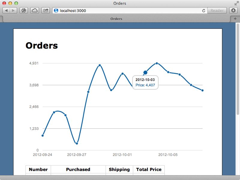
It would be nice if we could figure out what caused this spike. To help with this we can break down the graph depending on different attributes of the orders. Some of the orders are for physical products and have shipping while some aren’t. We’ll add more lines to the graph to show items with shipping separately from those without. To do this we can change our helper method so that we pass the data into the hash for each shipping style. We can call where on the Order model to fetch the shipped and unshipped orders and group them as we do all the orders.
module OrdersHelper
  def orders_chart_data(start = 2.weeks.ago)
    orders_by_day = Order.total_grouped_by_day(start)
    shipping_by_day = Order.where(shipping: true).total_grouped_by_day(start)
    download_by_day = Order.where(shipping: false).total_grouped_by_day(start)

    (start.to_date..Date.today).map do |date|
      {
        purchased_at: date,
        price: orders_by_day[date].first.try(:total_price) || 0,
        shipping_price: shipping_by_day[date].first.try(:total_price) || 0,
        download_price: download_by_day[date].first.try(:total_price) || 0
      }
    end
  end
end
Note that to reduce duplication we’ve made the start date an argument to the method, with a default value. Now that we have this additional data we can add it to the chart and Morris makes this easy to do by passing in additional ykeys. We’ll add some additional labels, too.
jQuery ->
  Morris.Line
    element: 'orders_chart'
    data: $('#orders_chart').data('orders')
    xkey: 'purchased_at'
    ykeys: ['price', 'shipping_price', 'download_price']
    labels: ['Total Price', 'Shipping Price', 'Download Price']
When we reload the page now our graph has two additional lines showing the totals for the unshipped and shipped orders.
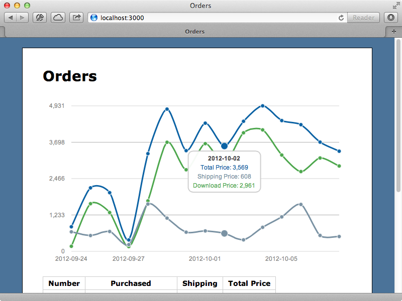
We can see now that the extra orders are caused by extra download orders and that the shipped orders remain fairly constant throughout the time period. Also notice that when we hover over a point the amounts for each line at that time are shown, although the amounts aren’t shown with their currency symbol. We can fix this by passing in a preUnits argument.
jQuery ->
  Morris.Line
    element: 'orders_chart'
    data: $('#orders_chart').data('orders')
    xkey: 'purchased_at'
    ykeys: ['price', 'shipping_price', 'download_price']
    labels: ['Total Price', 'Shipping Price', 'Download Price']
    preUnits: '$'
When we reload the page now the currency symbols are shown. There are many more options that we can pass into Morris and the site has details about these.
Morris is an impressive library for adding graphs to a website but because of its simplicity it won’t fit every need. There are alternatives that are worth considering and one of these is Rickshaw. This is a powerful library for making graphs and offers a lot of flexibility in how the graphs are presented. It’s simple to use but can require more code to create a simple timeline graph than Morris.
Another option is called Highcharts. Thas is very polished and fual-featured and allows us to create some beautiful graphs. It’s biggest downside is that it isn’t free for commercial use and this needs to be taken into consideration when comparing it with the other options.


